
Training details
Learn how to make your data more visual with impactful Excel charts!
In-person / Remote?
Both in-person and remote options available
Level
Medium
Prerequisites
Basic knowledge of Excel
Target Audience
Anyone wishing to illustrate data using charts
Objectives
By the end of this practical training, participants will be able to:
- Create various types of charts
- Modify charts
- Choose the appropriate chart type
- Build sophisticated charts
- Create chart templates
Detailed Program
- Succeeding with a chart: Steps to follow
- Analyze the data
- Define the message to convey
- Determine the comparison to illustrate and choose an appropriate chart
- Format the chart and enhance its impact
- Avoid common pitfalls
- Building and formatting a chart
- Different types of charts
- Quick reminder of basics
- Adjusting and completing source data for easier analysis
- Referencing data on one or multiple sheets
- Adapting axis scales and series plotting order
- Modifying legends, titles
- Inserting free text, images
- Handling missing data – ignoring or interpolating
- Displaying a trendline
- Creating elaborate charts
- Combining multiple types of charts into one
- Creating a step chart, half-pie chart, gauge chart
- Building a Pareto chart
- Plotting an age pyramid
- Using Sparklines
- Implementing a pivot chart to illustrate a summary
- Techniques and tips for customizing a chart
- Automating chart updates by linking to a dynamic data range
- Linking cell content to chart title
- Connections with Word and PowerPoint
- Inserting a chart into PowerPoint and animating it step by step
- Pasting a chart into Word as an image
- Creating a chart template
- Tips and tricks
Duration
1 day
Quality Training’s Excel Basics Course
Designed for a professional audience, whether in remote or in-person settings at our facilities, the training offered by our organization, Quality Training, will equip you with all the skills for effective use of Excel. Perfectly suited for all skill levels, whether you’re an executive or an employee, Quality Training’s course focuses primarily on practical instruction. It covers various topics to enhance productivity in your professional life while mastering one of the most powerful software in the market.
Topics Covered in the Course
During this training, you’ll learn how to illustrate different data from your Excel database using comprehensive and aesthetically pleasing charts. Over the course of a full day, numerous points will be covered to help you understand and master this aspect of the software. Constructing and formatting your chart, linking your illustration between Word and PowerPoint, and the best tips to personalize your chart will all be addressed. With highly qualified trainers by your side, you’ll learn to choose the most suitable chart style for your needs and modify it within your Excel environment through practical workshops.
Successful Charting
As you’ll see throughout your training, creating a successful chart doesn’t happen with the snap of a finger. There are several steps to follow for its proper implementation.
- Data analysis: Before starting the chart’s design, it’s important to study, sort, filter, and simplify your data so that your illustration is as relevant as possible.
- Define the message to convey: Similarly, you need to verify the accuracy of your data and understand the message your chart will convey. The construction of your illustration will differ depending on whether it’s about sales tracking, overall company expenses, or any other estimation.
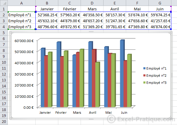
- Determine the comparison to illustrate and choose an appropriate chart: Once these steps are done, you can choose the chart style to implement. Many templates are available, such as the line chart, which effectively highlights sales trends.
- Format the chart and enhance its impact: Naturally, you’ll use various software tools to adapt your chart and personalize it according to your preferences. Adjusting colors, layout, style changes, etc.
- Avoid common pitfalls: During the training, a thorough focus will be given in the form of tips and advice to avoid pitfalls related to building an Excel chart.
Building a Chart
During the fundamental step of designing your Excel chart, you’ll learn more about the different types of existing charts to ensure you make the right choice. We will guide you in adjusting and completing your source data to facilitate your analysis. Once these reminders are covered, you’ll be able to choose your illustration from a range of templates recommended by the software. You’ll also adapt axis scales and series plotting order. Our professionals will be there to assist you at each of these steps.
Formatting
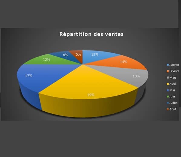
Of course, your software interface allows you to format your charts by customizing them to meet your various needs. Whether it’s a dynamic chart, line chart, or pie chart, you can insert titles or images, modify your legend, add titles, or even move your chart to another worksheet. With us, you’ll discover all the ways to make your illustrations more intuitive than ever.
Enhancing Your Charts
The goal of this Excel function is to provide a professional audience with sophisticated charts that effectively illustrate summaries. We will guide you through discovering the most comprehensive options: creating a step chart, implementing a pivot chart to perfectly illustrate a data summary, or even combining several charts into one!
Linking Your Charts to Word and PowerPoint
Do you want to import a chart designed in Excel to another interface in the Office Suite? That’s definitely possible. The software allows you to link with the word processing software Word and the presentation software PowerPoint, both capable of producing high-quality documents and presentations!
Word
Another indispensable software often used in business, Microsoft Word needs no introduction! With this interface, you can format numerous reports. Naturally, among the possible options, the software also allows you to add charts. But if you want to add your own illustration created in Excel, that’s possible too. You can even display it in multiple steps and directly modify it within Word.
PowerPoint
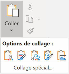
PowerPoint software enables you to create comprehensive and high-quality presentations. As having an explanatory chart is often more effective than long and sometimes pompous paragraphs, you can add your Excel chart as an image within your presentation. It’s quite simple:
The process is essentially a copy-paste operation to bridge the gap between the two software.
The process is essentially a copy-paste operation to bridge the gap between the two software.
Becoming an Excel Expert with Quality Training
Established in 2008, our organization Quality Training has become a true reference over the years, focusing on office software training for businesses. Regardless of your field of activity, Microsoft Excel is a software rich in features that can enhance your efficiency at work. Therefore, we offer you the option to choose our Excel course, as well as other specialized courses that cover specific concepts: pivot tables, basic functions and formulas, introduction to macros, etc.